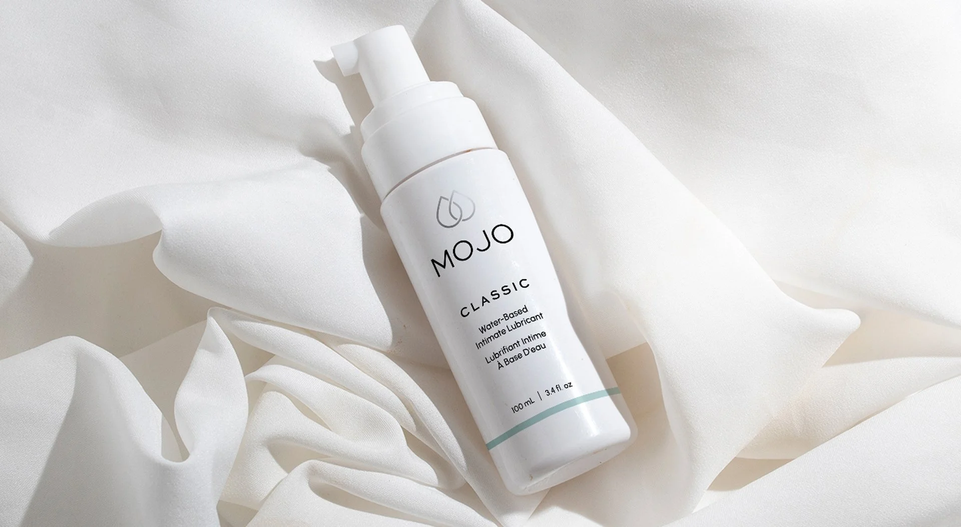
Mojo
The creator of Mojo had a clear vision for her brand, but needed a designer to help bring it to life. She saw a gap in the market as she walked the sexual health aisle of her local drugstore: most products on the shelves felt dated or tacky. She imagined a product that would stand out on the shelves, in line with the beautiful packaging you might find at Sephora.
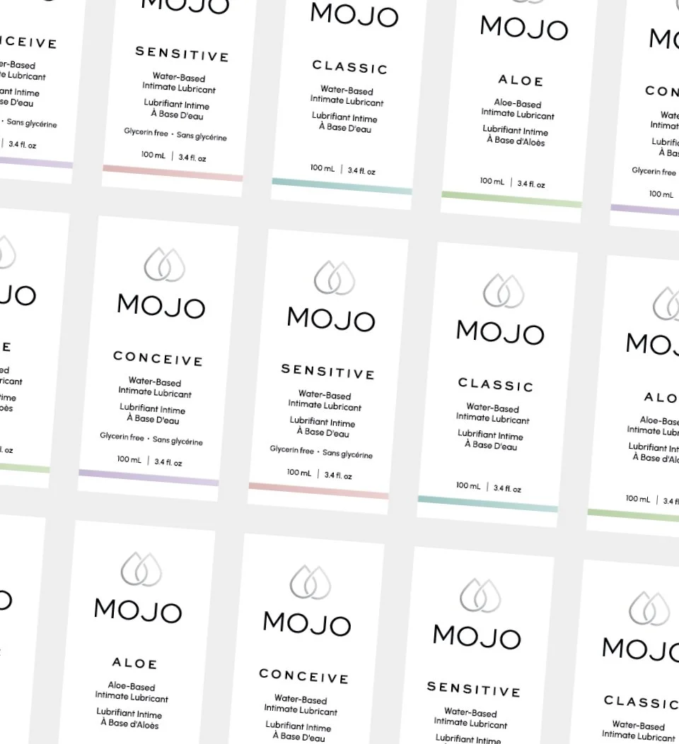
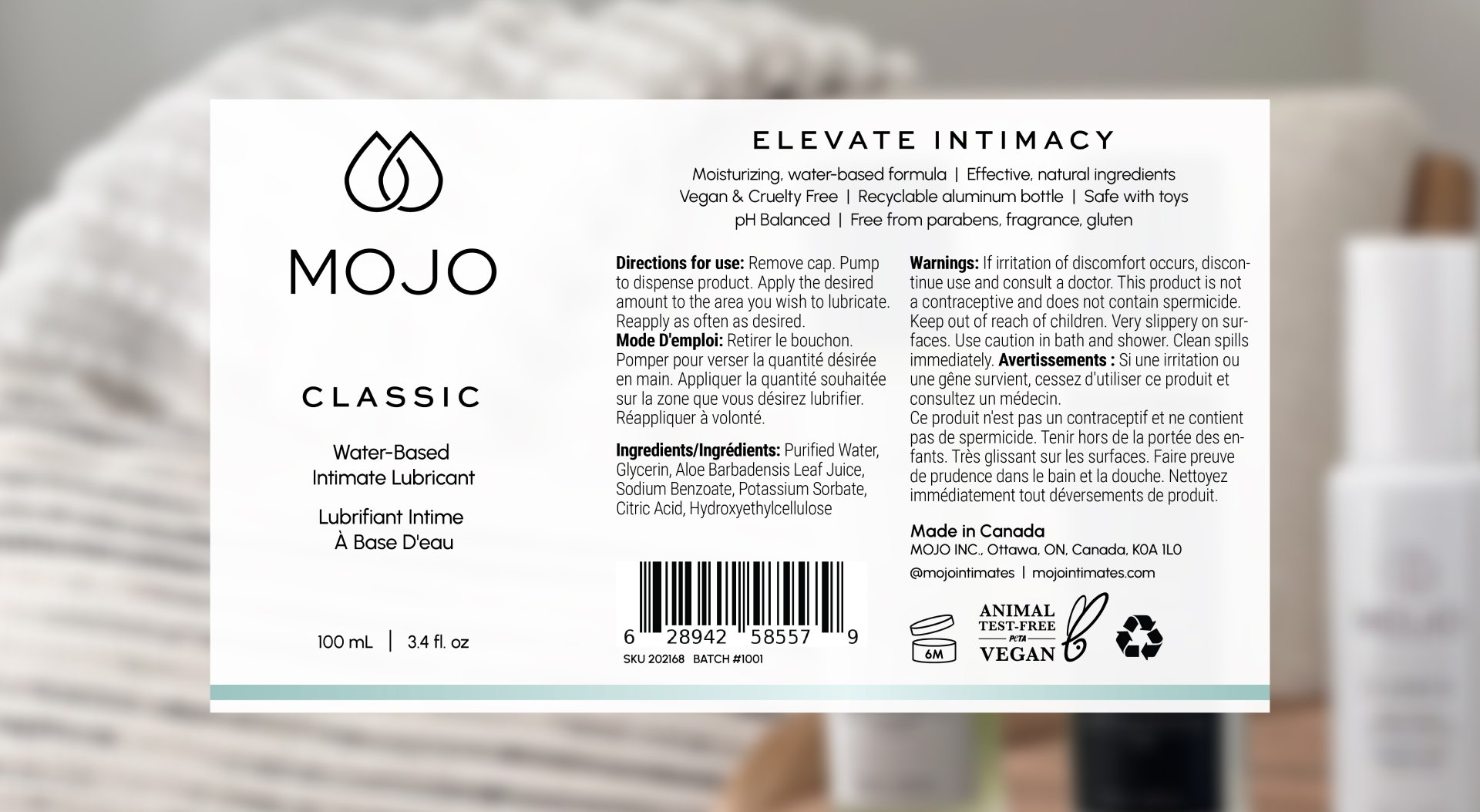
We first nailed down the logo design: sophisticated and clean with a hint of intimacy. From there, I designed the range of lubricant packaging, maintaining a luxurious, minimalistic look while ensuring all necessary information and labels were clear across five product variations.
The result is a cohesive brand and packaging system that stands out on shelves, elevates the product’s market presence, and aligns perfectly with the founder’s vision.
Project scope
Brand design, packaging design